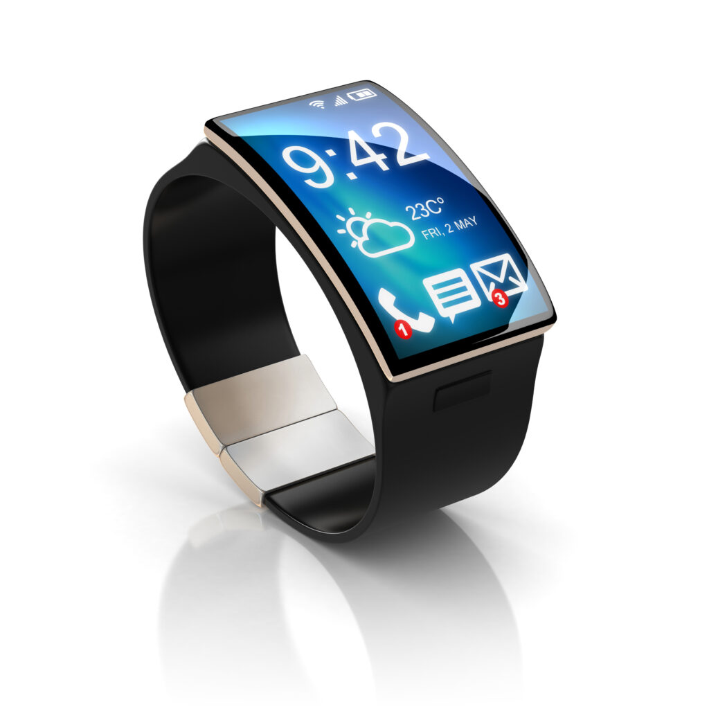
Wearable technology may turn out to be a hot seller during the 2016 holiday season, according to a December 6 article in the Wall Street Journal. This is a good thing for Apple, Fitbit and other manufacturers of smartwatches and fitness monitors, as the increases in sales of wearable technology appears to be flattening and a holiday surge could improve the numbers.
Even if the possible holiday surge in sales does not materialize, a large number of people already use these devices. Forbes reported that manufacturers shipped 50 million wearable devices in 2015.
Ecommerce retailers, ignore these numbers at your peril. Make sure your websites function on wearables!
Millions of Devoted Wearable Users Represent a Big Market. Don’t Ignore It.
The jury is still out on whether wearables will become the next must–have item long term. Nevertheless, managers of existing ecommerce websites must make sure that they have taken the existence of wearable technology into account in the functionality and design of their websites.
According to a Forbes magazine report in May 2016, one in six consumers owns wearable technology—watches, glasses, step counters and even jewelry. Ignoring this audience could mean a potential revenue loss for your business.
7 Design Principles for Wearable Websites
What makes a website display effectively on wearable platforms? Read the top 10 most important requirements below.
- Think small. Most entrepreneurs like to think big. Designing for wearables is one instance where you should think small. Minimalist design, small print, and limited number of buttons and choices are a few of the features that make for a good wearable website. Be ruthless Eliminate anything that is not essential. The best wearable website pages have one or two words and an image. That’s it.
- Use color. High-contrast colors, rather than written instructions, can simplify the display while telling users what to do. Use pastels and low-saturation colors sparingly if at all.
- Keep it simple. This is not the place to go in for flashy design elements. There should be nothing on a website for wearable display that is not essential for getting users to do what you want.
- It’s not just visual. Think of using vibration and voice activation to guide users through the process. That takes up no space on a display, and consumers can quickly figure it out—they are used to it.
- Always use a sans-serif typeface. Helvetica is the most used sans-serif typeface. That makes it good but also over-familiar. Popular alternatives include Grotesk, Folio, Unica, Neuzeit, Maison Neue, Nimbus Sans, Univers and Standard CT.
- Mirror your other designs. The wearables website design should include as many elements of your site as it appears on other platforms as possible. Color, typeface and overall appearance should be similar to preserve your brand.
- Don’t be afraid of scrolling. Scrolling is back in style. Back when desktop websites were the only game in town, designers avoided scrolling because they believed that no one would actually scroll down. That is no longer true thanks to smartphone and tablet use, and wearables are a great place to use scrolling to enhance the user experience. And remember, scrolling can occur both vertically and horizontally.
Get Experienced Design Help for a Wearable Website
If your website works well on a wearable display, it can be the basis of a great mobile display as well. The lesson is this: Simple is good.
Even if your site’s simplicity is based on new and complex web design technology, the end-user interface needs to be clear, minimalist and easy to use. If you struggle with handling this on your own or with your own in-house design team, look to an experienced web marketing company that has specific knowledge and experience with wearable design.

